FoodLink

A solidary network.

Role: UX Designer and Front-End developer

Platform: Web Application

Tools: Vue 3, Laravel, CSS, PHP, SQL, Figma, MapBox

Timeline: 4 Agile Sprints (Academic Project)

Overview

How might we connect food waste with hunger relief? Developed as an academic project, FoodLink is a dual-sided platform serving two key users: Restaurants with surplus food and Volunteer Riders.
Restaurants publish available food packs in real-time, while volunteers use an interactive map to locate both the food and the recipients. The standout feature allows the community to pin the locations of homeless individuals, creating a live, crowdsourced database to guide deliveries effectively.

FoodLink Overview Mockups FoodLink Overview Mockups

The Problem

The Disconnect: While local restaurants often face the challenge of managing surplus food, homeless individuals struggle to access daily meals due to mobility issues or lack of information.

The Gap: There is currently no streamlined, real-time channel that connects this surplus with the volunteers willing to deliver it. Furthermore, the transient nature of homelessness makes it difficult for volunteers to know exactly where to deliver aid efficiently.

User Research

01. Defining the Dual Experience (Personas)
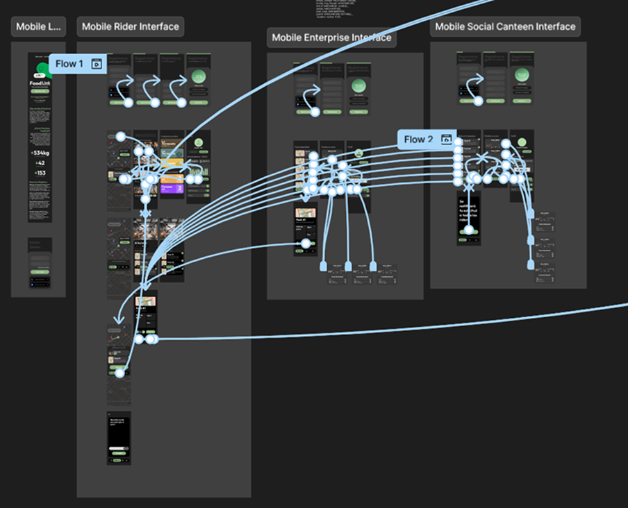
Since FoodLink operates as a two-sided marketplace, we began the project by developing distinct personas to address the unique motivations and pain points of our two primary user groups:

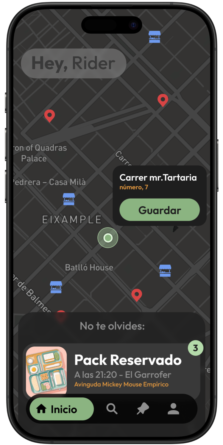
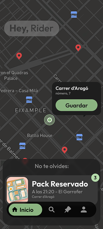
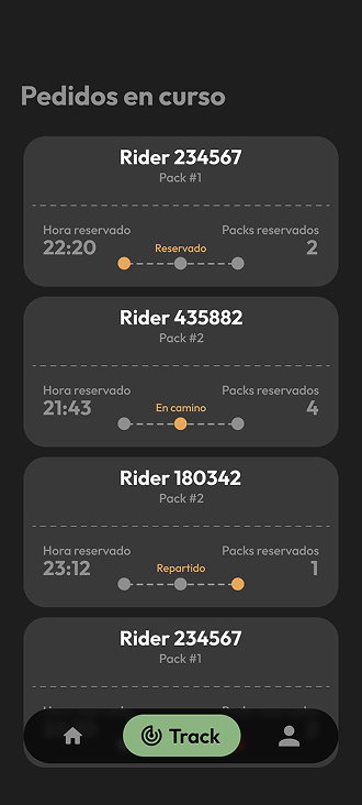
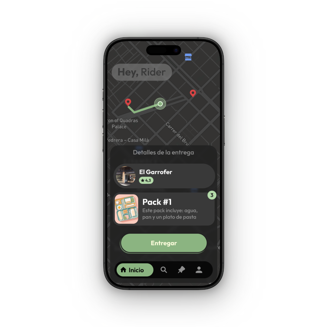
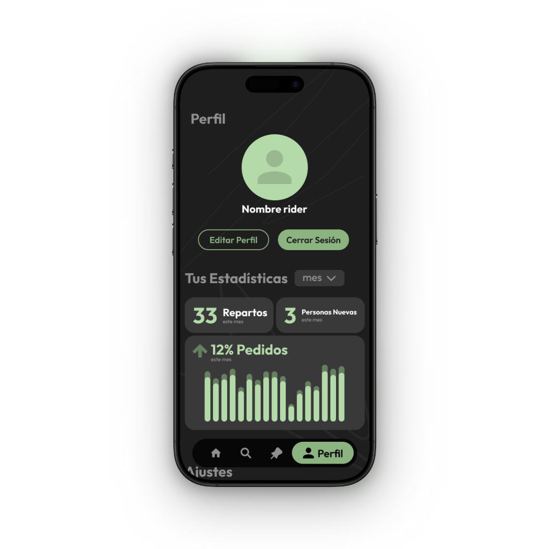
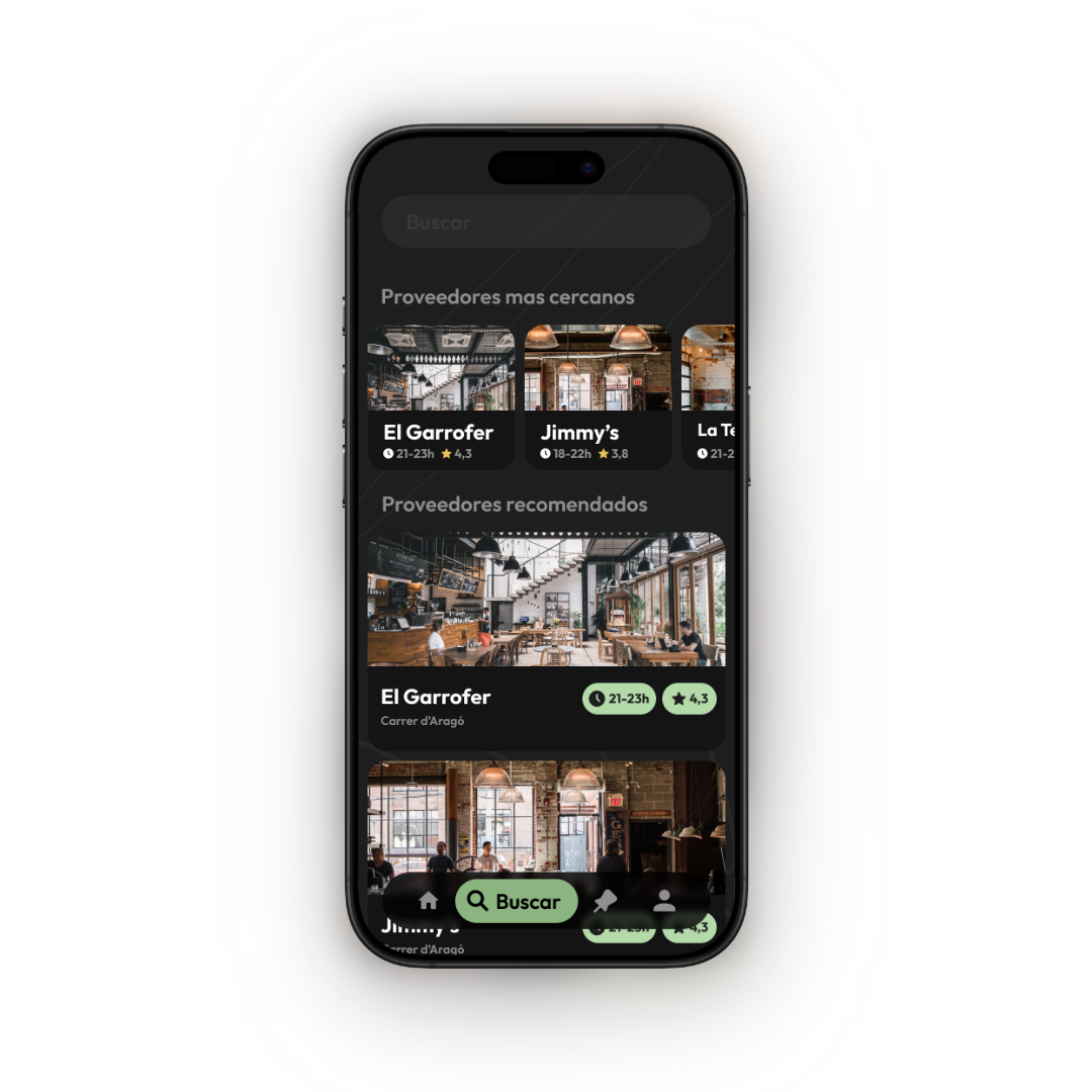
  • The "Solidarity Rider" (Volunteer): Driven by altruism but limited by time. Their primary need was an intuitive map interface to locate recipients quickly without friction.
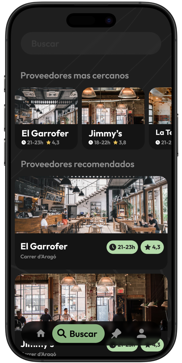
  • The "Partner Restaurant" (Donor): Focused on operational efficiency. They needed a seamless flow to publish surplus food packs in seconds during busy service hours.

02. Cross-Functional Usability Testing
To validate our assumptions, we conducted a comprehensive peer-review session involving students from both Web Development (DAW) and Marketing courses.

  • Methodology: We utilized a "round-robin" testing strategy where groups exchanged prototypes to perform core tasks (e.g., "Publish a pack" or "Locate a recipient").
  • The Value: While development peers focused on functionality and bugs, the marketing students provided a critical layer of feedback regarding desirability and brand perception, simulating a real-world stakeholder environment.

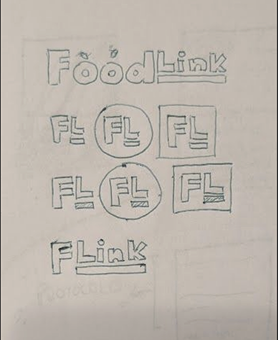
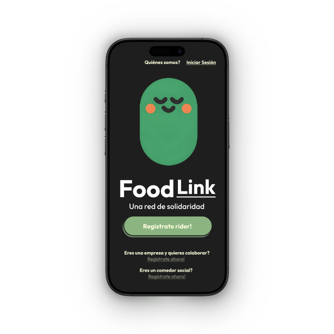
03. The Key Iteration: Emotional Design
The most impactful insight came from the marketing cohort. Feedback indicated that while the app was functional, the UI felt too "transactional" and cold for a platform based on charity and human connection.

The Solution: We iterated on the UI to introduce Emotional Design elements. We created a friendly brand mascot to guide users through the experience. This wasn't just an aesthetic choice; the mascot served to:

  1. Humanize the interface: Making the act of helping feel warmer and more rewarding.
  2. Reduce cognitive load: Acting as a visual guide during the onboarding and delivery confirmation steps.

Wireframing & Prototyping

Initial Sketches

Sketches Sketches Sketches

Wireframes

Wireframes Wireframes Wireframes Wireframes

Prototype

Prototype

Final Result

As a joint design and development project, the final deliverable was a fully functional web app. Seeing the crowdsourced map operate in a live environment validated our initial UX research.

  • High-Fidelity Mockups: Final UI polished for both the Restaurant and Rider flows.
  • Live Demo Recordings: Footage from our final academic presentation, showing the fully coded prototype successfully connecting a food surplus publication with a live pin drop on the map.

Wireframes Wireframes Wireframes Wireframes Wireframes